

When a redesign fixes one problem and reveals another
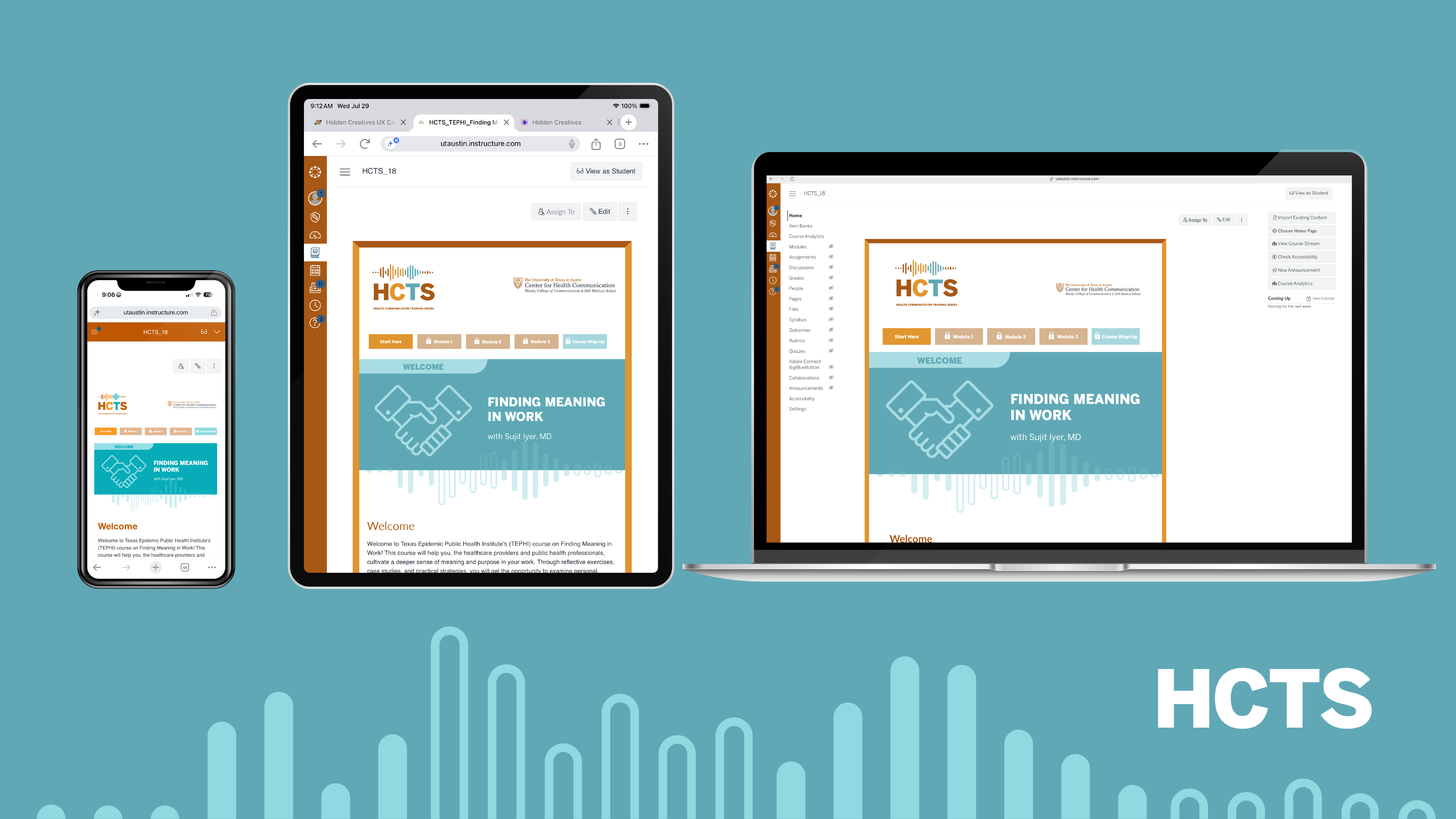
The Health Communication Training Series (HCTS) launched in 2021 to meet the continuing-education needs of clinicians, public health professionals, and other adult learners through 30–60 minute asynchronous courses.
The program has since grown to 20 courses across two generations: HCTS 1.0, the original 2021-era design, and HCTS 2.0, a 2024 redesign intended to improve on it.
This case study covers two phases of my involvement: building the original course experience, and, later, investigating why the redesign, meant to improve completion, wasn't performing as expected. The second phase is the more analytically demanding of the two, and it's where the most senior-level work happened.
Phase 1 is where this all started. Before there was a redesign to investigate, a team of two, built an asynchronous series of courses from the ground up. These courses had to work for healthcare professionals squeezing continuing education between patients, lunch and any other moment they could spare. Everything in this phase, the research, the wireframes, the template that would eventually scale across the full 20-course catalog, was built around our healthcare professionals' limited bandwidth.

Our team of two (an instructional designer and myself) was tasked with building easy-to-navigate, asynchronous courses using University of Texas-approved tools (Canvas LMS, H5P, Panopto), none of which are especially intuitive for learners unfamiliar with academic LMS platforms.

The purpose of the Health Communication Training Series is to meet the demand of health communication training to healthcare professionals, that of which is very high. Our learners are incredibly busy, so the interface and content should make learning easy, enjoyable, and responsive. If they need to work on their phone or tablet during their lunch break, our courses should make that possible by implementing responsive design. I also had to ensure that the interface prevented learners from advancing in the course before completing each module in sequential order to ensure an optimal learning experience.
User research identified a real need among current providers seeking CME/CNE credit, UT students supplementing their medical school applications, and concerns about time constraints and interface complexity.


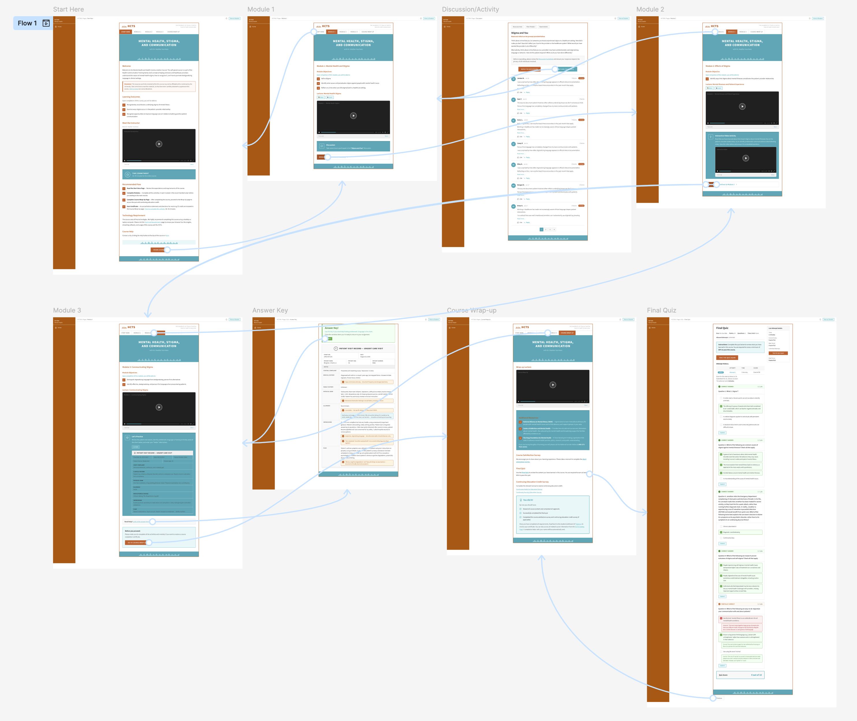
When developing the the flow for HCTS, keeping the lessons sequential was paramount. We wanted to ensure each user completed all the activities before moving to the next module.
Site map → user flow diagram enforcing sequential module unlocking → paper wireframes → Figma low-fi prototype → hi-fi prototype, refined into the template used across all 20 courses in the catalog.


Once HCTS 1.0 shipped it performed extremely well. HCTS 1.0 and 2.0 have a 4.85/5 average learner satisfaction score, 5,300+ course enrollments, and has garnered several partnerships with reputable health organizations.
Leadership KPIs
Partners Resulting from HCTS Courses




Learner Feedback from Qualtrics Surveys
Learner Feedback
TEPHI - AI in Health Communication
I liked the practical focus of the course the most. The explanations of prompting techniques, real-world health communication examples, and hands-on activities made it easy to understand how AI can support tasks such as developing communication materials, adapting content for different audiences, and improving efficiency. The course also emphasized the importance of human oversight and fact-checking, which is essential in public health.
Learner Feedback
Visual Design in Health Communication
I appreciated the simplicity in content breakdown, and the specific examples used to highlight the topic being discussed. It was nice to see that the course used the very skills it was teaching to help instruct and convey the information.
Learner Feedback
Health Literacy and Clear Health Communication
I appreciated how practical the course was, especially the focus on plain language and teach-back. It reinforced how communication structure directly impacts patient outcomes.
Learner Feedback
Mental Health, Stigma, and Communication
I liked how much awareness and the truth behind stigma that this course showed. I felt seen and heard, as someone that suffers from mental illness.
In 2024 it was time to build on what we'd learned. HCTS 2.0 launched with a redesigned flow meant to improve completion rates and encourage learners to fill out the satisfaction survey. However, comparing completion rates from 1.0 to 2.0 told a different story, which meant going back into a project I'd already considered finished.
HCTS 2.0 was built to improve on 1.0 with better navigation. So when I pulled completion data across both generations, the result was the opposite of what a redesign is supposed to produce:
That's the kind of finding that could easily get shrugged off. Usually newer courses need more time to accumulate completions. However, I decided to dig into the data to ensure the re-design was the issue before implementing any changes.
During this process I discovered the most consequential problem: more learners were actually finishing courses than official completion records showed
During this process I discovered the most consequential problem:
More learners were actually finishing courses than official completion records showed
Cross-referencing Canvas completion data against Qualtrics survey submissions surfaced a pattern of LTI passback failures. This is the technical handoff between Canvas and the accreditation/survey systems, and it was silently dropping completions that had, in fact, happened.

This reframed the entire investigation: the problem wasn't only (or even mainly) that learners weren't finishing courses, it was that the system wasn't recording that they had.
A screen-by-screen UX audit comparing pre- and post-redesign course versions initially suggested navigation was working fine across the board. It wasn't. Two 2.0 courses, Pain, Opioids, and Hard Conversations (POHC) and Diversity, Health Equity, and Health Communication (DHEHC) turned out to have missing navigation buttons, confirmed after a closer pass and since fixed. I'm including this catch-and-correct moment deliberately rather than smoothing it over.

A related discovery emerged around how module completion requirements were being validated against final grades. This was a mismatch that, like the crediting gap, meant the system's record of "who finished" didn't fully match reality. (Full detail available in the internal research report; summarized here to keep the case study focused on the throughline rather than every technical branch.)

(Full detail of findings available in the internal research report; summarized here to keep the case study focused on the throughline rather than every technical branch.)
Once the crediting gap and navigation issues were accounted for, HCTS's true completion rates, 40.1% for HCTS 1.0, 26.4% for HCTS 2.0, turned out to run roughly 2–4x above published benchmarks for comparable free, asynchronous certificate courses. The redesign's story wasn't, "the numbers went down." Its true story was, "the redesign solved the problem it targeted, testing revealed a new one, and here's what I did about it."
The redesign's story wasn't
"The numbers went down"
its true story was
"The redesign solved the problem it targeted and testing revealed a new one. Here's what I did about it"
Once the friction points were identified, I made sure to add any "return to module" buttons in qualtrics surveys that our team has access to. I then advised my instructional designer to work on the following tasks:
Completion rate isn't one of HCTS's tracked KPIs. Leadership measures the program by enrollment volume, learner feedback, and conversion into HCLI participation or new CHC projects, and by every one of those measures the program was already succeeding. I went looking into completion anyway because I noticed the 1.0-to-2.0 gap myself and wanted to be certain the redesign wasn't quietly making the course experience worse for the learners going through it, regardless of whether it showed up on a KPI report. If the investigation had pointed to the redesign itself actively harming completion, reverting to the 1.0 flow was on the table.
It didn't. Most of the gap turned out to be a data-reconciliation problem, not a design regression, and the redesign genuinely fixed the hand-off friction it targeted.
Most of the gap turned out to be a data-reconciliation problem, not a design regression, and the redesign genuinely fixed the hand-off friction it targeted.
The redesign fixed real problems, but without investigating the completion discrepancy, I would have missed the actual issue, likely resulting in even worse completion rates. The value I added wasn't just finding the numbers. It was refusing to accept my first hypothesis before getting the full picture from our data.

