Building the first event of its kind in Tulsa, and the privacy problem that shaped every decision.
Hidden Creatives is the first event of its kind in Tulsa, OK. The two-day studio tour spotlights emerging artists in their own homes, studios, and partner businesses. As the founder, I owned the project independently from end to end. I implemented the research, brand identity, UX/UI, content, partnerships, and event operations, on a roughly six-month timeline.
This case study focuses on the UX side of that work, specifically, how early research with both artists and visitors directly shaped three major design decisions: a privacy-gated map system, an information architecture built around stated user needs, and a mid-project scope pivot that traded one kind of user preference for another under real-world constraints.

Tulsa has no shortage of talented artists working outside the traditional gallery system. They work from their bedrooms, garages, shared spaces, and homes. Many lack the visibility that comes with a formal studio or representation, and the public has no easy way to discover them.
Hidden Creatives changed that by organizing a studio tour focusing on emerging artists. However, this model comes with a real tension baked in: the entire premise depends on publicly listing where artists physically are, such as home addresses, for an audience that includes total strangers. That tension of visibility versus safety turned out to be the central UX problem of the entire project.
The most consistent theme wasn't excitement about visibility, it was hesitation about exposing their safe spaces to complete strangers. Several respondents raised their home address directly as a concern:
Prospective Creative Survey
Concern About Security & Suggestion #1
"Maybe limit the actual addresses to a limited window of time before the event and end it afterwards. Leave up the info they shared/photos/descriptions/etc but just take out their physical address."
Prospective Creative Survey
Concern About Security & Suggestion #2
"I'm okay with sharing my address, but I'd like it to disappear after the event."
Beyond privacy, creatives named their priorities for what the site needed: a map view, a list view, filters (medium, location, accessibility), mobile-friendly navigation, and artist highlights all came up repeatedly as essential. Several were explicit that they didn't need much beyond that.
The dominant theme was trust and comfort visiting an unfamiliar, sometimes private space. "Photos of the space or work" and "clear hours and expectations" were the two most-cited things that would make a stranger's home or studio feel safe to walk into. On structure, most respondents leaned toward a contained, plannable experience: many requested to "stay within one area," and to have "a rotating neighborhood event every few months." One respondent mentioned "decision fatigue/paralysis" as a reason for a smaller geographic footprint rather than a citywide sprawl.
Alyssa Thomas, 37, represents the hesitant creative. She is someone with real work and real talent who's unsure how she'd benefit from participating, worried about attracting the wrong audience, and wary of unclear expectations. Her goals and frustrations map directly onto the recurring themes in the creative survey.
Her goals: Community connection, the right audience for her work, intentionality in her even participation, and a clear return on the time she invests.
Her Frustrations: Past events that weren't beneficial, privacy hesitation, a siloed art scene, and attracting the wrong audience.

Gerald Brown, 58, represents the time-conscious visitor. He's genuinely interested in supporting local art but frustrated by not knowing where or when events happen, and wants the experience to be efficient rather than overwhelming. His goals and frustrations illustrate the visitor survey's emphasis on clear expectations, mobile-friendliness, and trust.
His goals: Discover new creatives without stress, seeing multiple studios efficiently, knowing all information before visiting a studio, and feeling comfortable entering unfamiliar spaces.
His Frustrations: Doesn't know where to find events, very complex websites, inefficient tools.

Keeping both personas active while designing is part of why the privacy-gating decision and the map/filter-driven IA both made the cut. They're the two places where Alyssa's and Gerald's needs most directly intersect.
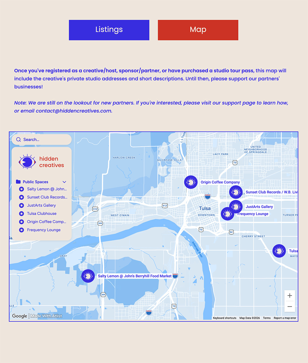
The address concern wasn't an abstract survey response. It came up repeatedly in direct conversations with artists during recruitment, as well as in the survey data. I treated it as a non-negotiable and built the site around it:
This is a case where user research produced a specific, buildable requirement rather than a general sentiment. The fact that no artist withdrew over privacy concerns during the actual event suggests the system did its job.
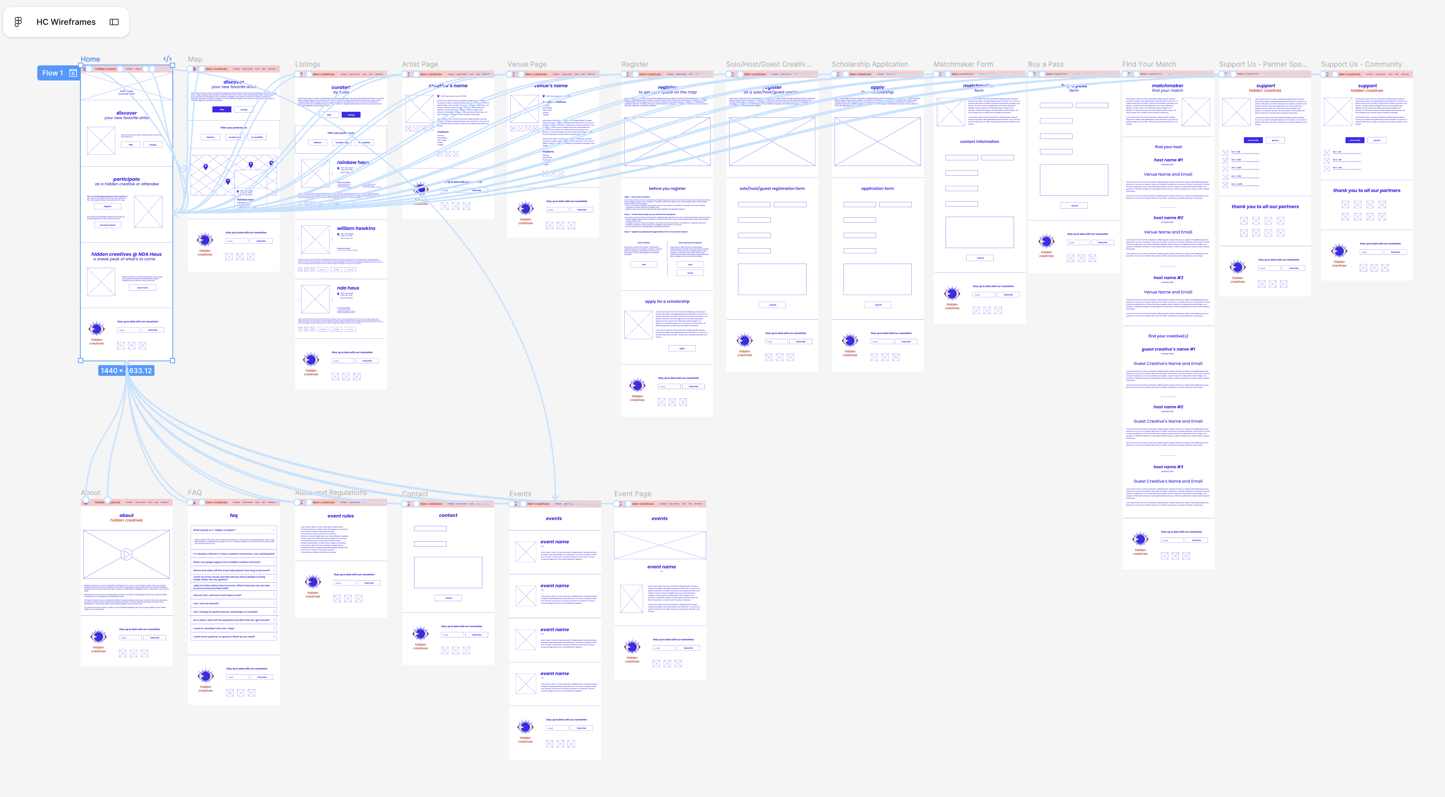
The wireframes' core navigation, Map / Listings toggle, a filter panel for Medium, Location Type, and Accessibility, and a dedicated "Artist Listings," maps almost directly onto what both surveys named as essential. Where respondents said they likely wouldn't use a feature, I left it out; where the same handful of features (map, filters, mobile-first, clear event info) kept recurring across both audiences independently, I made sure they anchored the homepage rather than being buried.

This is the decision I'm most interested in talking about in interviews, because it isn't a clean "research told me what to do" story. It's a case of two legitimate signals pointing in different directions, and having to choose.
The original concept was scoped specifically to North Tulsa, partly reflecting the geographic containment visitors said they preferred. There were recurring requests to to stay within one area and have neighborhood-sized events.









Rather than building a static site and leaving it up unchanged, I treated the site's content as living document, removing sections as they became irrelevant. This was a small, but deliberate, UX decision to prevent confusion among creatives and attendees:
Scholarship application deadline passed → Scholarship section removed
Creative registration deadline passed → Matchmaker and registration pages removed
Event concluded → All address and pass-purchasing information removed
This also closed the loop on the original privacy concern. Address data wasn't just gated during the event, it was deleted from public view entirely once its purpose had passed.
Attendee Review
Event Promotion
"I loved your promotion of the event on Instagram. I loved the artist features... the overall vibes were immaculate!"
Hidden Creative Review
Creating Community
"Meeting people and swapping ideas! I especially loved being able to put a face to names I'd seen before, and meeting new creatives just starting out."
Several creatives independently said the best part was simply meeting other artists and community members . This validated Hidden Creative's mission of connection and visibility.
Attendee Review
Navigation Challenges
"The only challenge I ran into was the plug-in used for the map. It didn't load very well on my phone... I ended up having to type the addresses in manually."
Attendee Review
Navigation Challenges Continued
"Some tech difficulties w/ the map. Improve that and/or have a physical map."
Multiple creatives also suggested incentivizing attendees by implementing a bingo card or passport for each studio. Those who complete those interactive activities will be entered into a drawing at the end of the event.
One creative tried to do a scavenger hunt on their own, which attendees and creatives mentioned this in the post-survey. More people wished they had known about the activity and requested a way to collaborate with one another more easily.
Two independent respondents hit the same friction point unprompted. That's a real signal, not noise.
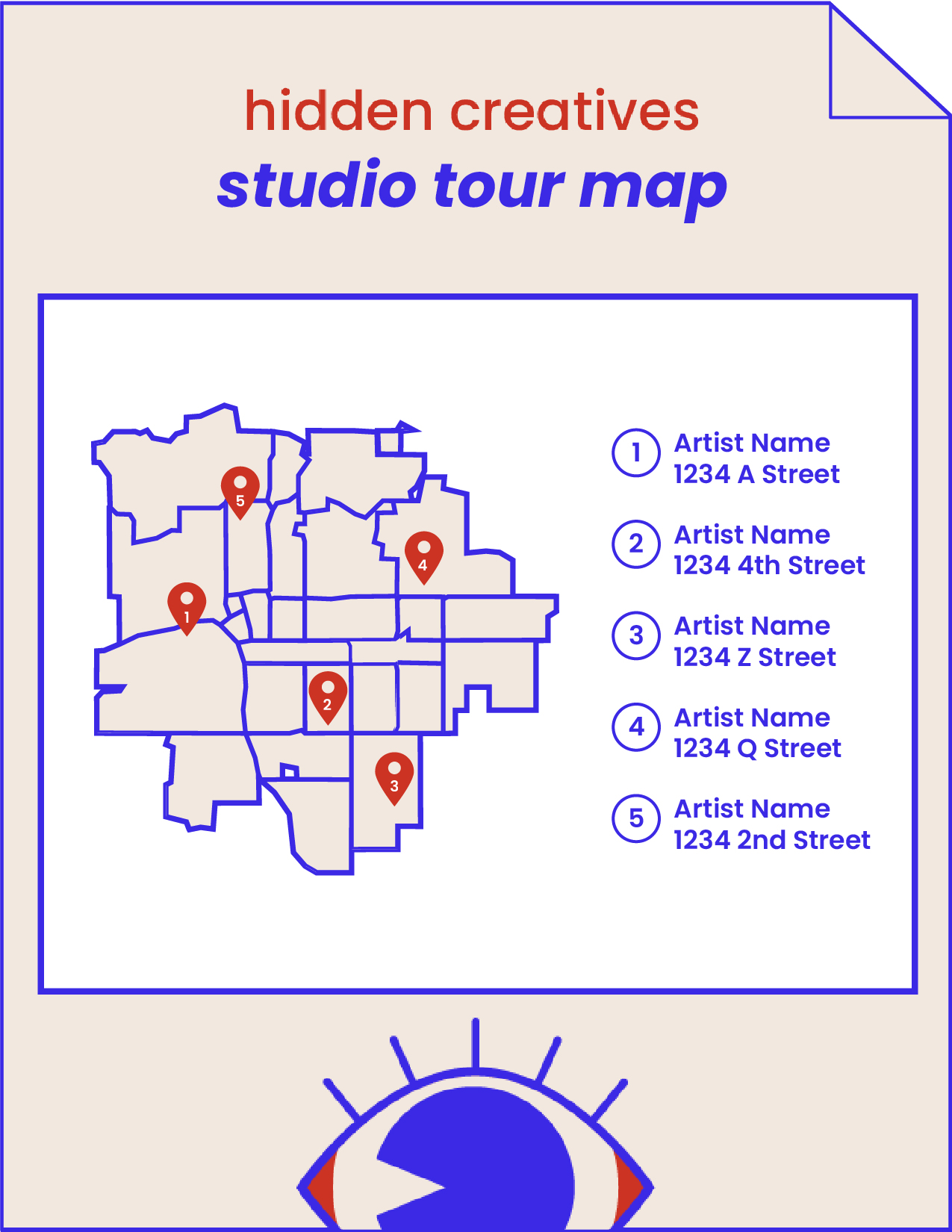
I'm planning develop a bingo-card or "passport" activity for 2027 attendees, designed and owned as part of the core event this time, rather than left to last-minute artist initiative. Attendees who complete the activity will be entered to win a prize at the end of the event.

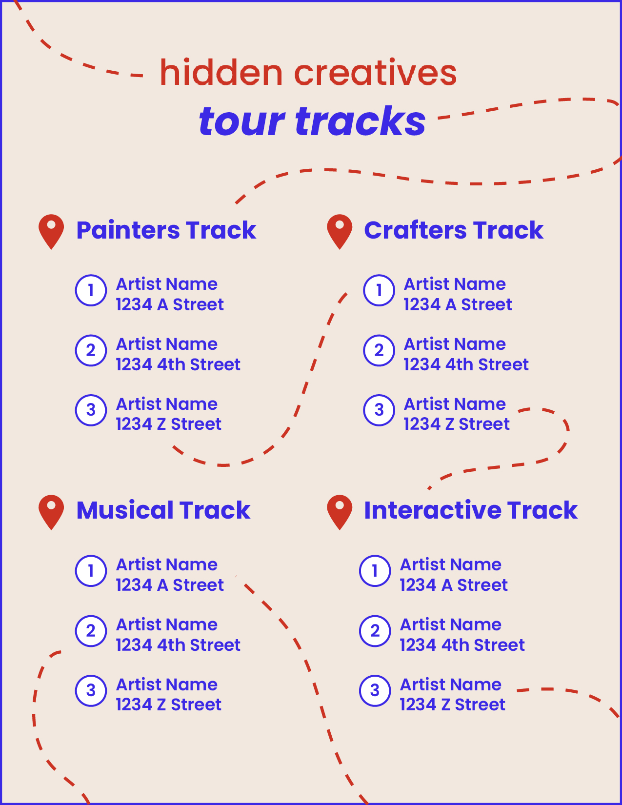
In addition to the game incentive, I plan to introduce curated tracks: a series of stops based on themes, media, and/or geography. This will also encourage attendees to visit more than one stop on the tour.
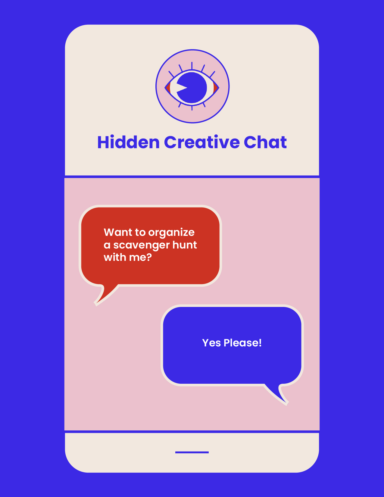
I plan to conduct a survey to ensure I do this in the most efficient way possible. Options may include a chatroom on the website, WhatsApp, or Discord.
Artist inclusion mattered more than preserving the original scope of the event. This next iteration will create an even bigger impact once the feedback from user surveys above is implemented.