UX RESEARCH CASE STUDY

A Work in Progress

This is an ongoing case study and project.

CLIENTS
Hidden Creaties
ROLE
UX Researcher & Designer · Information Architecture · Brand Designer
TOOLS
Figma · HTML/CSS · Adobe Suite · WIX · Claude
TIMELINE
May 2026-Present
DATA
WIX Analytics · Internal Event Rentals Log · Stakeholder Interview
PROJECT OVERVIEW

Tulsa Clubhouse

Tulsa Clubhouse is a locally owned event space available for private rental (parties, weddings, showers, retirement events) that also hosts a free weekly community event, Second Story Sessions, where local musicians perform new work or practice for their peers. The business was preparing for a rebrand and website redesign, and needed UX research to inform structure and strategy before applying new visual design.

The Problem

Tulsa Clubhouse's website was attracting a growing volume of high-intent visitors — traffic had grown more than 400% year-over-year, and roughly a third of engaged visitors navigated straight to the pricing-equivalent page — but converting almost none of them into inquiries. Click-to-contact rate sat under 1%, and the site had no dedicated space for the venue's biggest differentiator, its weekly community event. The site functioned as a brochure, not a booking or community-building tool, leaving the business dependent on referrals and word of mouth rather than the website itself.

How Might We...

1

Help a high-intent visitor on the rental page take the next step, when today under 1% do?

2

Help visitors self-sort into "private rental" vs. "community event" within the first few seconds on the homepage?

3

Introduce Second Story Sessions in a way that builds a returning audience, given returning visitors currently sit at just 8%?

Data Sources

Wix Analytics
(July 2025–June 2026): navigation flow, top pages, session/bounce data, category benchmarks
Internal Event Rentals Log
 (Feb 2025–Nov 2026 bookings): booking frequency, revenue by event type, referral patterns
Stakeholder Interview
with the owner: goals, constraints (HoneyBook-based lead capture), desired page structure

Key Findings

1

1,742 sessions over 12 months produced only 14 total contact clicks (9 phone, 5 email, 0 WhatsApp) — a sub-1% click-to-contact rate

2

81% of all sessions start on the homepage; of visitors who go deeper, 33% head straight to the pricing-equivalent page, a strong buying-intent signal

3

53% of visitors drop off after the first page, and 60% of those who reach the pricing page leave without contacting anyone

4

Returning visitors sit at 8%, and social referral traffic at 11% — both below the benchmark for fast-growing peers in this venue category (25% social)

5

The rentals log shows revenue is currently driven by referrals and repeat clients, not the website

Competitive Audit

I audited three comparable Tulsa event venues to understand conventions for pricing transparency, booking flow, and audience segmentation: Vinterra (upscale wedding/event venue), The Bellview (historic building; weddings, social, and corporate events), and Zora Studio (small multi-use space, closest in scale to Tulsa Clubhouse).

VINTERRA
THE BELLVIEW
ZORA STUDIO
TULSA CLUBHOUSE
PRICING
Dedicated "Pricing" nav item
Dedicated "Pricing" page
Priced per-hour via Peerspace marketplace
Full tiered pricing table (by day type and guest count), on the Services & Pricing page
PRIMARY CTS
3-step flow: Discover spaces → View pricing → Check availability
"Book your event today" throughout
"Ready to book? Send an inquiry"
Phone / email / WhatsApp click only
AVAILABILITY
Live calendar page
Inquiry-based
Instant booking via Peerspace
Not shown
AUDIENCE SEGMENTATION
Weddings vs. general events (separate nav)
Weddings vs. social vs. corporate (separate pages)
Single use case
Rental vs. community (proposed)
RECURRING COMMUNITY PROGRAMMING
None found
None found
None found
Second Story Sessions (weekly, free)

Proposed Information Architecture

Based on the analytics and audit, the five pages the owner requested were mapped into a structure that puts the conversion gap and the community differentiator at the center: Homepage forks into Rental Inquiry, Community Events, and About, with Rental Inquiry and Community Events both leading into a Contact/Booking page carrying the embedded HoneyBook form.The audit refined what belongs inside these pages rather than the page structure itself — the Rental Inquiry page needed to absorb pricing and availability signaling that competitors spread across multiple pages, and the Community Events page needed elevated visual/content treatment as a differentiator, without adding pages beyond the owner's original five.

HOME
RENTAL INQUIRY
COMMUNITY EVENTS
ABOUT
CONTACT /BOOKING

Personas

To keep both sides of the marketplace in view while designing, I built two personas grounded directly in the survey data above:

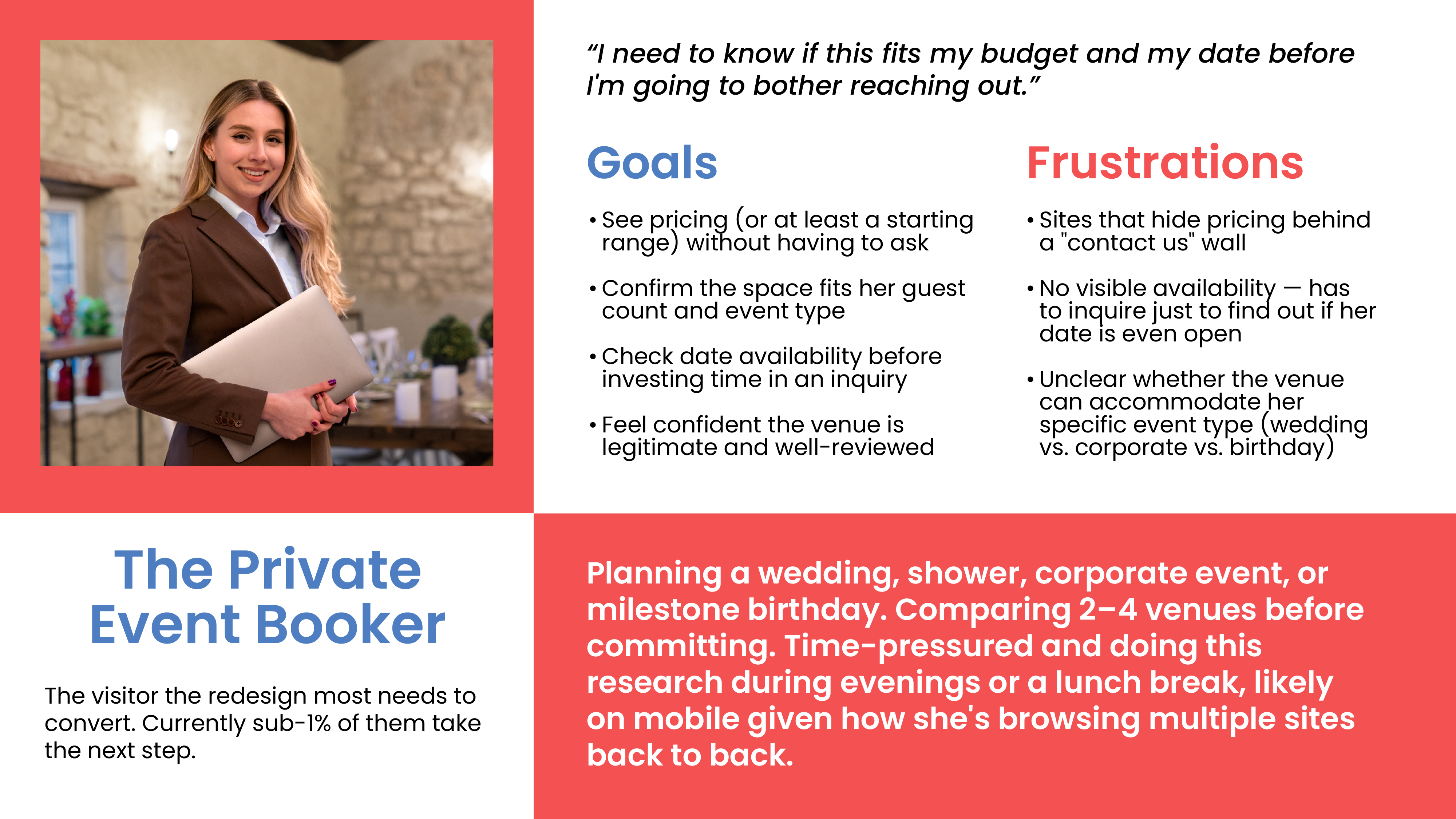
The Private Booker
Why She Matters

 She's the reason the Rental Inquiry page leads with "Starting at $X / evening," shows capacity and setup options immediately, and embeds a live availability calendar instead of forcing an inquiry just to ask "is this date available?" Every one of the current site's weak points (sub-1% click-to-contact, 53% bounce rate) is arguably her bouncing off exactly the friction this page now removes.
A persona of David Cooper, a medical intern who is taking courses to boost his resume.
The Second Story Regular
Why They Matter

They're the reason Second Story Sessions got a full dedicated page instead of a buried nav link, with atmosphere photos and a plain "doors open 7:00 PM, free admission" callout instead of a sales pitch.

A persona of David Cooper, a medical intern who is taking courses to boost his resume.

Lo-fi Wireframes

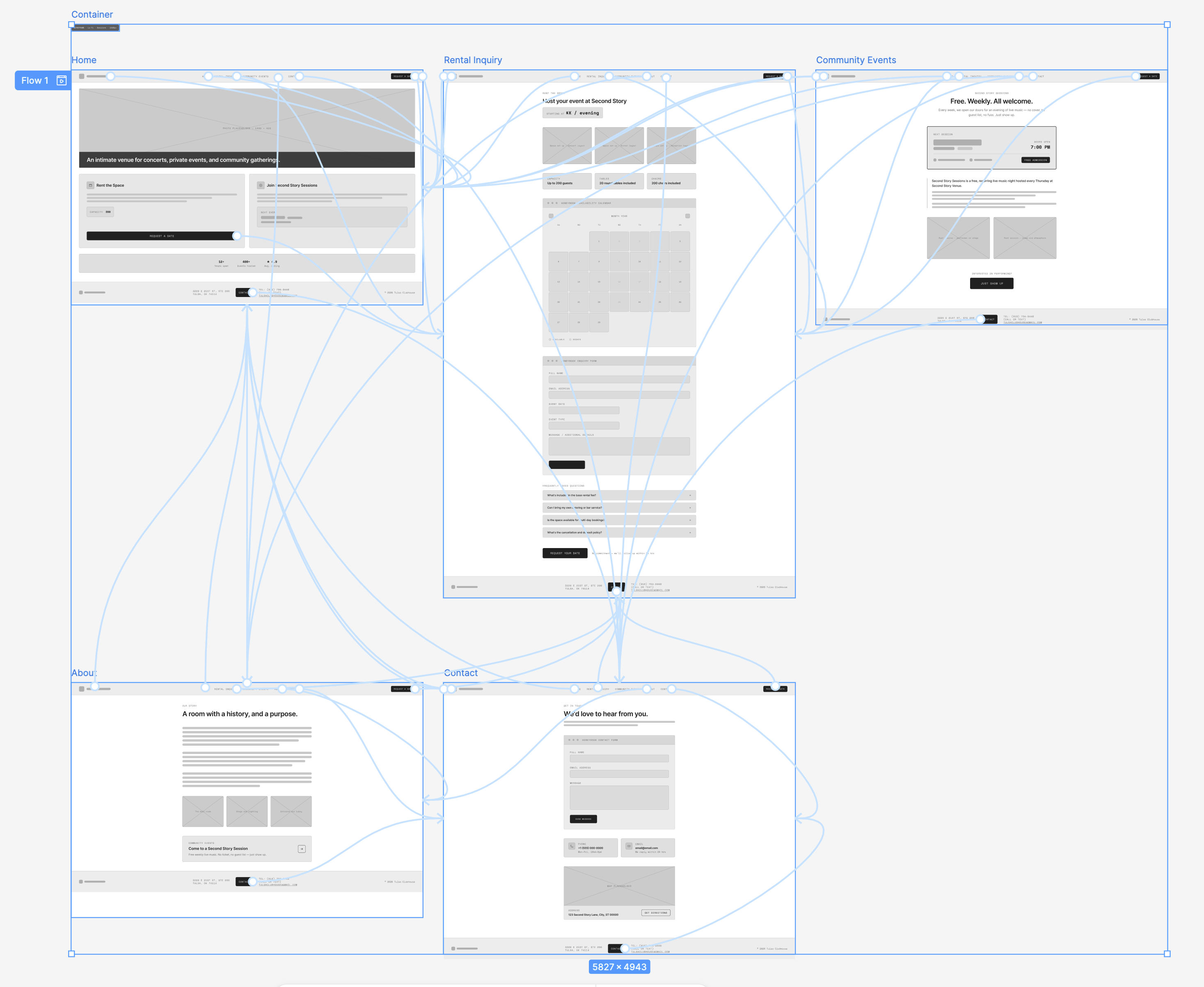
For this project, I tried a different approach from my usual paper wireframes-to-Figma process. I used the native Figma AI tool, First Draft, to generate the lo-fi wireframes here. Afterward, I tweaked the design to ensure the userflow, navigation labels (based on tree tests), and features were optimized for a lo-fi prototype and testing.

Usability/Testing

1
Tree Test

Using ValidateThat.io, I created a tree test to ensure the menu labels didn't cause confusion for Tulsa Clubhouse users.

89.1%
Success Rate
0:13
Avg. Completion Time
87.5%
Avg. Directness
2
First-click Test

Address the citywide sprawl directly rather than relying on visitor motivation alone. Given the genuine interest in the scavenger hunt concept, I'm planning a formalized bingo-card or "passport" activity for 2027 — designed and owned as part of the core event this time, rather than left to last-minute artist initiative.

3
Moderated Usability Test

This will help ensure that good ideas from a participating creatives don't depend on word-of-mouth to reach attendees.

None of these undo the case for the pivot itself — artist inclusion mattered more than preserving the original footprint — but they're the concrete next-iteration backlog it created, grounded in what users said afterward rather than assumptions about what "citywide" would require.

4
Comprehension Check

This will help ensure that good ideas from a participating creatives don't depend on word-of-mouth to reach attendees.

None of these undo the case for the pivot itself — artist inclusion mattered more than preserving the original footprint — but they're the concrete next-iteration backlog it created, grounded in what users said afterward rather than assumptions about what "citywide" would require.

Final Design

If I ran this again, three things stand out as the highest-leverage fixes, all downstream of the citywide expansion:

1
Lorem Ipsum

 Two independent respondents hit the same friction point unprompted — that's a real signal, not noise.

2
Lorem Ipsum

Address the citywide sprawl directly rather than relying on visitor motivation alone. Given the genuine interest in the scavenger hunt concept, I'm planning a formalized bingo-card or "passport" activity for 2027 — designed and owned as part of the core event this time, rather than left to last-minute artist initiative.

3
A clearer communication path for artist-led activities

This will help ensure that good ideas from a participating creatives don't depend on word-of-mouth to reach attendees.

None of these undo the case for the pivot itself — artist inclusion mattered more than preserving the original footprint — but they're the concrete next-iteration backlog it created, grounded in what users said afterward rather than assumptions about what "citywide" would require.

Outcomes/Takeaways

If I ran this again, three things stand out as the highest-leverage fixes, all downstream of the citywide expansion:

1
Lorem Ipsum

 Two independent respondents hit the same friction point unprompted — that's a real signal, not noise.

2
Lorem Ipsum

Address the citywide sprawl directly rather than relying on visitor motivation alone. Given the genuine interest in the scavenger hunt concept, I'm planning a formalized bingo-card or "passport" activity for 2027 — designed and owned as part of the core event this time, rather than left to last-minute artist initiative.

3
A clearer communication path for artist-led activities

This will help ensure that good ideas from a participating creatives don't depend on word-of-mouth to reach attendees.

None of these undo the case for the pivot itself — artist inclusion mattered more than preserving the original footprint — but they're the concrete next-iteration backlog it created, grounded in what users said afterward rather than assumptions about what "citywide" would require.